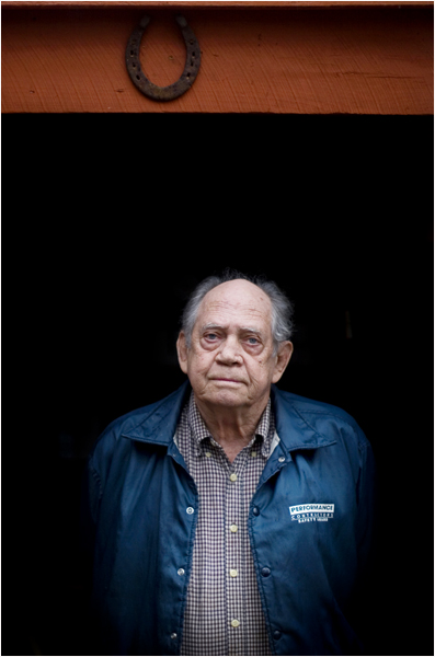
hmm ... hard to pick - the portraits are very different. i suppose it would depend on if it were in your portfolio and it was being used with other photos, then i would pick the one that offered more visual variety to your presentation. picture-against-picture i'd probably pick the most recent post - the vertical because it has a layer and and interesting composition ... i like how he kind of comes out of the darkness. plus i like his humble expression - where as the other tight shot is good, but it offers less to the viewer - just my two cents.
I think I'd go with this one too. The other one is a great expression and has a nice timeless feel, but I think this one says your style a bit more. I feel I can see more about you in this photo than the other. I love how he's protruding from the darkness. I'd try it in black and white as well.
Thanks for the compliment, its pretty simple really. I had him stand in the doorway to his shed and exposed for the light hitting his face which was just natural light on a rainy/cloudy day. This let the background fall to black. I shot it with a 50 mm lens at 1.4.

6 comments:
I really like that thin red line at the very top of the photo. Only an moron would crop that out.
hmm ... hard to pick - the portraits are very different. i suppose it would depend on if it were in your portfolio and it was being used with other photos, then i would pick the one that offered more visual variety to your presentation. picture-against-picture i'd probably pick the most recent post - the vertical because it has a layer and and interesting composition ... i like how he kind of comes out of the darkness. plus i like his humble expression - where as the other tight shot is good, but it offers less to the viewer - just my two cents.
I think I'd go with this one too. The other one is a great expression and has a nice timeless feel, but I think this one says your style a bit more. I feel I can see more about you in this photo than the other. I love how he's protruding from the darkness. I'd try it in black and white as well.
This picture is excellent. The shadows are amazing. Could you give us a little detail about the setting/lighting?
JD-
Thanks for the compliment, its pretty simple really. I had him stand in the doorway to his shed and exposed for the light hitting his face which was just natural light on a rainy/cloudy day. This let the background fall to black. I shot it with a 50 mm lens at 1.4.
Thanks, I did not know if the fade to black was natural or not...
Post a Comment